Vaults
Contents
- Summary
- Panel Access
- Connecting to the Content Vault
- Navigating the Vault
- Panel display detail
- Vault Items
- Placing a Component Item
- Searching for Components
- Using the Filter Pane
- Column-based Filtering
- Grouping Results
- Vault Item details
- Right-Click Menus
- Commands for the Vault Folders Region
- Commands for the Items Region
- Commands for the Lifecycle View
Parent page: EDesign Data Panels
The Vaults panel provides access to components and data hosted in the Altium Content Vault.
Summary
The Vaults panel is a direct interface between CircuitStudio and the Altium Content Vault – a cloud-based repository of up-to-date, lifecycle-managed component data created and maintained by Altium.
From the Vaults panel you can access a large range of vault-based components and their details, including valuable design data and information on pricing and parts suppliers. Components can be placed from the Vaults panel directly into your designs.
Panel Access
To open the Vaults panel, select File » Vault Explorer from the main menu.
Connecting to the Content Vault
If a connection has not already been established to the Content Vault, the Vaults panel will display a 'Not Connected' status in its upper left corner. To set up the vault connection, click the Not Connected link (or its associated menu  button) and choose Vault Administration from the drop-down menu.
Use the Vault management controls to connect to the Content Vault and Refresh the panel's contents.
This opens the Data Management – Vaults page of the Preferences dialog, Click the button to establish the connection to the Altium Content Vault – click OK or Apply to ensure that the Vault will be re-connected each time CircuitStudio is started.

The Content Vault connection is configured in the Preferences - Vaults page, which can also be accessed from the File » System Preferences button.
Navigating the Vault
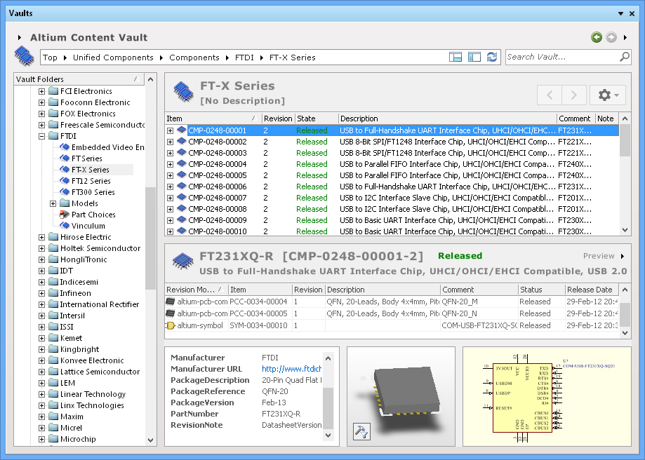
When populated with component data from the Content Vault, the Vaults panel provides a tree-like folder navigation region on the left, and the list of component Items within the selected folder on the right.
The basic Vaults panel contents with the Vault Folder tree on the left and the Folder Items list on the right – the lower Item Details section closed.
The Vault Folder hierarchy is grouped at the high level as Components (specific manufacturer parts arranged in manufacturer named subfolders) and Components - Generic (standard sets of resistors and capacitors from no specific manufacturer).
The Vault content can be navigated in several ways:
- By clicking on a folder whose contents you wish to peruse.
- Using the Address Bar at the top of the panel. The Address Bar reflects the current folder being browsed, along with the hierarchical path to that folder. Click on any entry in the path to jump directly to that folder, making it the current folder being browsed. Alternatively, click on a icon in the path to display a menu of possible folders to navigate to. Selecting a folder in that menu will jump to that folder, making it the current folder being browsed. The Address Bar will update accordingly.
- Using the vault's search feature. Simply enter a keyword based on an Items comment or description and press Enter or click the magnifying glass icon. As you type, a predictive list of possible entries will appear – click on an entry to use it as the foundation for the search. The entire vault will be scanned and results of the search listed, in terms of matching Items.
The entire folder structure can be expanded or collapsed using corresponding commands (Expand All, Collapse All) available on the panel's right-click menu. Alternatively, use the standard and navigation icons to expand/contract the folders and subfolders.
To fully expand a particular folder and all its descendant sub-folders, right-click on that folder and use the Expand Subtree command.
Panel display detail
To configure the amount of detail displayed in the Vaults panel, use the icons located at the right-hand end of the Address Bar.
– Click to Hide/Display the Vault Folders navigation region of the panel.
– Click to Hide/Display the Item Details regions of the panel.
Vault Items
Component items stored in the Content Vault are generally composed of child items, namely component symbols and footprints. All items are actually stored as a series of Revisions to support the need for updates over time, so each occasion a component is updated by Altium, a new Revision is added (within a new subfolder). Updates can be minor (a new parameter added) or significant (change of specifications), but will be indicated as a sequence of numbered Revisions.
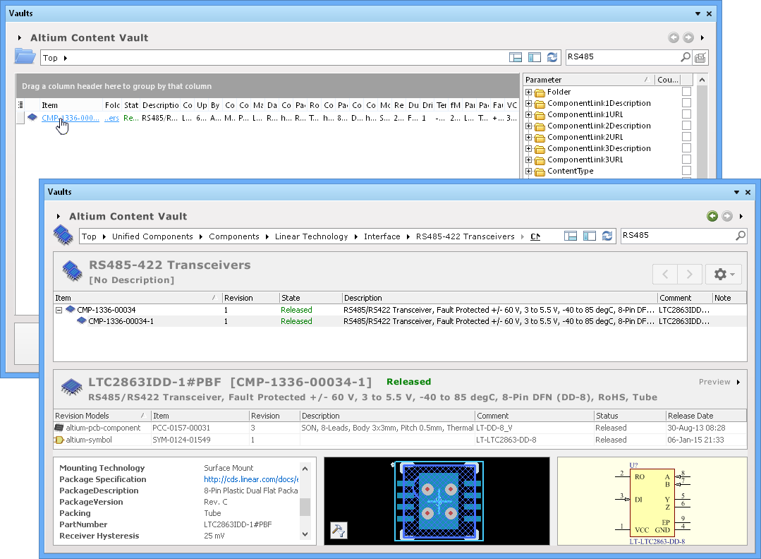
Each component revision listed in the Vault represents a unified part (similar to those in a local Integrated Library), and is therefore composed of symbol and footprint item revisions. These also reside in the Vault, and can be inspected by enabling the panel's Item Details region () in its Preview mode.
Navigating through Vault component items with the panel's Item Preview enabled shows the constituent items that make up a selected component.
Placing a Component Item
Placing components from the Component Vault is supported by the Vaults panel with a Place Component command, and the ability to drag & drop a component revision onto the active schematic document,
Simply browse the Content Vault for the required Item to be placed, then select and drag the part onto the CircuitStudio schematic, or right-click on the component item and select Place [component name] from the context menu. In both cases the component symbol will attach to the cursor so it can be placed in a suitable position on the schematic.
Place a component in your design by dragging a revision onto the schematic or by using Place xxx from the right-click menu.
Searching for Components
Beyond simply browsing through the vault content to locate what you need, the Vaults panel also allows you target specific components using its comprehensive search and filtering features.
To perform a search in the Vault, enter the search string in the Search field at the upper right of the panel, and press Enter, or click the Search button (). The search results may initially offer a range of content folders to choose from, where each contains 'hits' from your search – select a folder of interest (say one that represents a manufacturer), or simply select to All folder to include all search results.
The Component Item list region of the panel will populate with search results (rows), with all available item parameters (Description, Comment, Part Reference and so on) arranged in columns. The Vaults panel offers a number of different ways to filter and arrange the search results that help you find the exact component(s) you need.
Using the Filter Pane
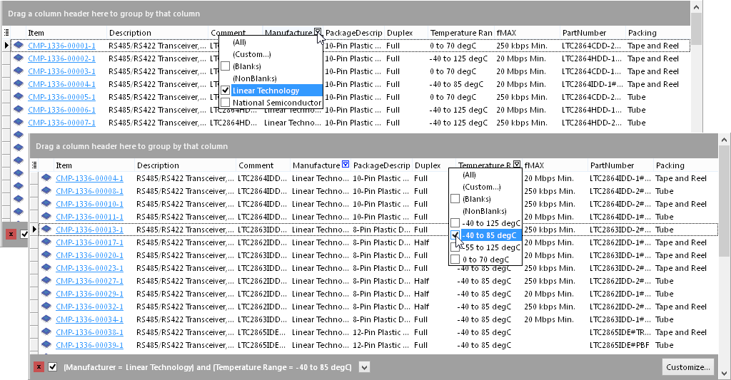
The Filter pane is particularly useful when a search delivers a large number of results that contain an extensive list of parameters (and their corresponding columns).
Click the button to open the pane. The Filter pane contains the full list of parameters and their content options for all component items returned by the search.
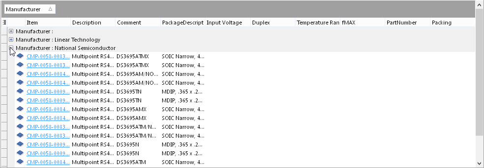
These can be used to filter the displayed results to show only the components that satisfy the parameters options you need. In the sequence of applied filter settings shown below, the RS485 search results are being progressively filtered to show components that satisfy a specific range of parameters – manufacturer, Fmax, temperature range, full/half duplex, package and so on.

In the example above, the search results have been filtered down to a single result that precisely matches the required parameters for an RS485 transceiver device, as shown below. Click the Item name (appearing as a hyperlink) to view the revisions of that component Item and its preview summary (lower region of the panel).
Column-based Filtering
An alternative method of filtering search results is to configure the parameter columns and apply column-based filtering.
As mentioned above, a search can result in a large number of columns being displayed. To enable or disable the display of a specific column, click the Column Control Button and disable any columns you do not want to be visible, as shown below.

The search results can be further filtered by the contents of each column. To apply a filter to a column, hover the cursor over a column header to display the small funnel (filter) icon, then click the icon and make a parameter choice, as shown in the example images below. The search result list will then only include component Items with that value.
In this way the list can be progressively filtered to show components that match your specification requirements.
Note that a composite filter query statement is shown in the region's lower bar. This represents the column filters that are currently in place, and can be reviewed and edited by clicking the  button to open the Filter Builder dialog.
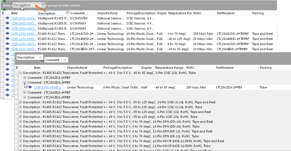
Grouping Results
To enable a more informative – and easier to browse – view of the search results list, its entries can be arranged show a hierarchy of only the item parameters that interest you. This is done by grouping the search results based on the column headings (item parameters).
To do this, simply drag and drop a column header onto the text that says Drag a column header here to group by that column (in the upper bar of the panel region). The component item list entries are then based on the column header, with further data exposed when the entry is expanded with the + icon. Additional column headings can be dragged onto the upper bar to create a deeper hierarchy of specific parameter information.
In the example shown below, the Description header has been dragged onto the bar, followed by the Comment header. As a result, all components that fall under a specific Description will be grouped together. Within that group items are further grouped together by Comment (generally a unique identity).
Alternatively, the grouping capability could be used to simply gather together the component items from each manufacturer – as shown below, for example.
Vault Item details
For each Item revision in a vault, the Vaults panel allows you to browse different aspects of that revision, where applicable. This is done using one or more views for that revision. At the top-level of this browsing functionality is a Summary view. From here, and depending on the type of Item being browsed, you can change to another view to explore where that revision of that Item is used (Where-Used), its child Items (Children or Preview), its current state (Lifecycle) and, for a Component Item, supply chain information (Supply Chain).
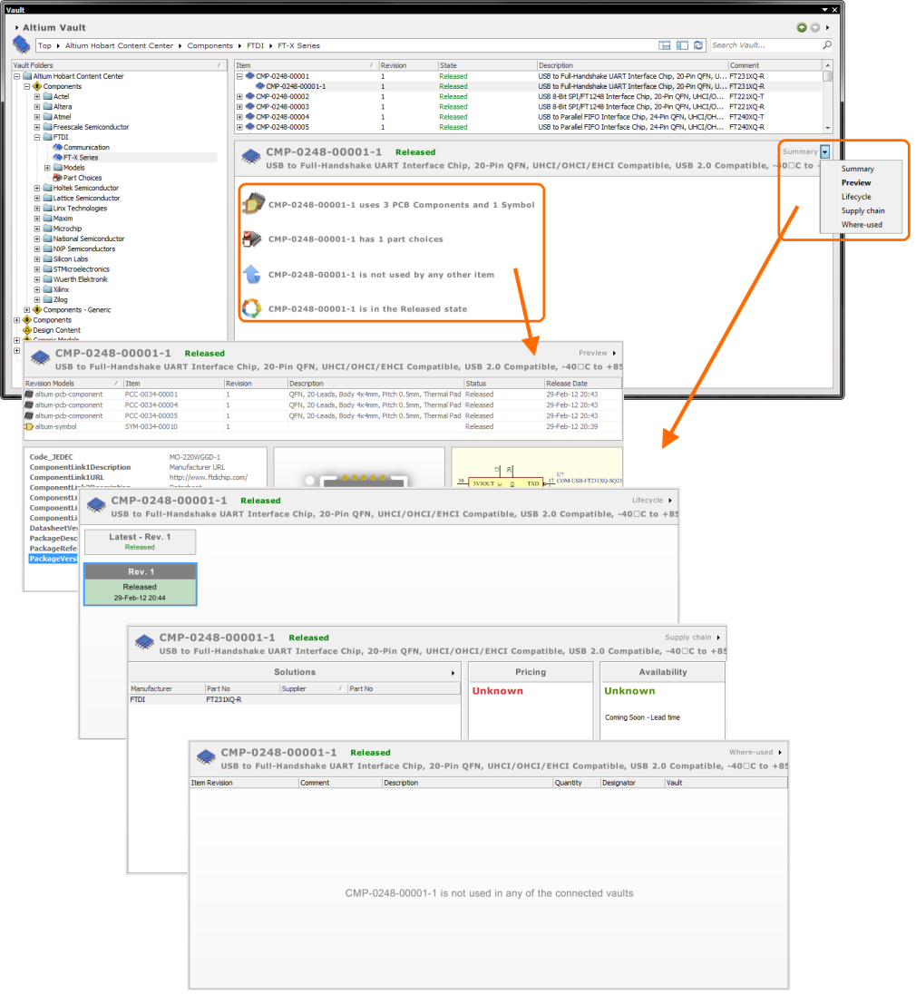
Browse different aspects of an Item revision using its associated views.
Right-Click Menus
Various commands are available from right-click context menus in the panel. The exact listing of commands will ultimately depend on the region of the panel in which you right-click, and the object currently in focus within that region. The following sections cover the commands available.
Commands for the Vault Folders Region
- Expand Subtree – use this command to fully expand the currently selected folder and all of its sub-folders.
- Expand All – use this command to fully expand all folders in the vault folder structure.
- Collapse All – use this command to fully collapse all folders in the vault folder structure.
- Refresh Vault – use this command to refresh the connection with the vault currently being browsed.
- Properties – use this command to access the Edit Folder dialog, from where related properties for the currently selected folder can be view and modified.
Commands for the Items Region
- Place Item-Revision – use this command to place an instance of the currently selected Item-Revision, where such placement is supported. For example, placement of a revision of a Component Item or Managed Sheet Item onto an active schematic sheet. The symbol for the component, or the managed sheet symbol, will appear floating on the cursor, ready for placement.
- Full Item History – use this command to access a detailed view for the currently selected Item, opened as a new tabbed view within Altium Designer. The Item View provides a highly detailed view of the Revision and Lifecycle history of a specific Item, as well as showing all of the elements that make up that Item. The view also includes a Timeline. Use the Timeline to examine the exact time and date of any change made to the Revision level or Lifecycle State of that Item, and whom the change was made by.
- Properties – use this command to access the Item Properties dialog. Here you can view the properties for the currently selected Item. If no revisions for that Item have yet been released, the properties can be modified.
Commands for the Lifecycle View
- Place Revision – use this command to place an instance of the currently selected Item Revision, where such placement is supported. For example, placement of a revision of a Component Item or Managed Sheet Item onto an active schematic sheet. The symbol for the component, or the managed sheet symbol, will appear floating on the cursor, ready for placement.
- View Revision Properties – use this command to access the Properties for Item Revision dialog, which provides a listing of properties associated to the parent Item, the selected Revision. Other properties are also listed, such as parameters for a component Item, or the parent design and configuration for a released board design Item.